Pop-ups are dead- so what?
First of all, let me just get this out in the open: there is nothing wrong with pop-ups per say.
Next, let me qualify what I just said: Pop-ups are ineffective as an advertising tool and are not recommended on the web since pop-up blockers are ubiquitous. E.g. Every browser and search engine tool these days has a pop-up blocker: AOL pop-up blocker, Google Toolbar pop-up blocker, Yahoo Toolbar pop-up blocker, Firefox built in pop-up blocker, third party free pop-up blocker tools…etc.
Google Killed the Pop-Up
From the late 90’s to the early 00’s Google quietly used it’s simple and easy to use design (read great user experience) to hijack the pop-up as a form of web advertising. If you remember every credible large and small website used pop-up windows for advertising and more. Google’s text advertising (right column block short phrase with a link) wiped out the pop-up since the click through rates (CTR) for text based advertising (or contextual advertising) were higher: under .5% CTR for pop-ups to 2-3% CTR for text ads.
Back to “There is Nothing Wrong with Pop-ups”
Pop-ups are not the problem. It is the forcing of them on your users without telling them, which also violates the permission-based marketing model. This issue is rarely understood I find due to the culture of pop-up hating. Yeah, I hate them too.
However, if it is appropriate to provide more detail such as help text, or larger images or diagrams- then by all means use a pop-up dialog! Just be sure that it is self-selected. In other words the user clicks to activate. Remember, pop-ups became hated because they forced themselves on users, got in their face, redirected their attention and cluttered up their train of thought.
The Pop-Up Blocker Error Message
Alas, with so many pop-up blockers (thank you to all the pop-up blocker tools) there is a need for a new kind of error message to help users orient to that which is supposed to be happening which isn’t happening.
You’ve done it right? Clicked on a link, page, image and then…(nothing). What happened? Oh it’s the pop-up blocker that ate it. So while you figured that out, the average user who is not savvy to browser features and functionality (such as pop-up blocking) will probably blink and miss the hidden “aha”…and then move on.
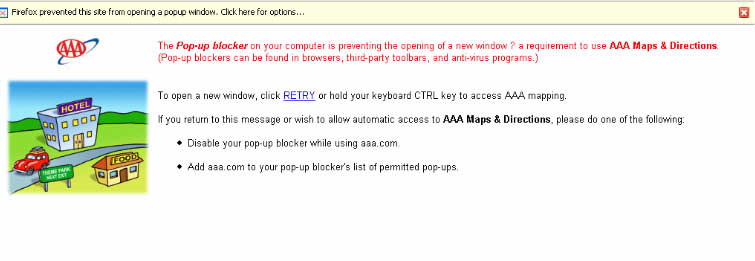
(Click image above to see an example of a good pop-up blocker error message)
The American Automobile Association website has a great example of a user-friendly pop-up blocker error message. Bottom line- anyone using pop-ups on their site needs one. Leaving the recovery from a pop-up blocker’s work to chance is not enough.
Usability Guidelines for Using Pop-ups?
So if you must use one of those pesky pop-ups (either self-selected or forced) be sure to follow the following usability guidelines for pop up dialog windows:
1. No intensive scrolling. Pop-up information (tables, images, text) should be short and sweet. e.g. 150-200 words max.
2. No left to right (horizontal) scrolling! Pop-ups are a limited attention adjunct to information. They serve the purpose on the web of the ellipse (…). We have seen pop-ups used that have long scrolling tables, buttons down, left, right, outside of easy reach. Our usability testing experience shows that users hate to scroll your pop-ups.
3. Tabs work well with Help Pop-Ups. A few tabs to help organize HELP information seems to work well. Again be careful the length of content. If you have that much to say, say it on a web page.
4. Use the pop-up blocker error message (above). No brain-er, but rarely used. Nice work AAA!
5. Let the user self-select a pop-up always. Unless you are doing some kind of intercept (for a survey or exit email capture offer).
So, next time someone says “I hate pop-ups” and everyone grumbles and says “yeah, me to” you can smile and say to yourself “yeah, but…”
Now, let me go close some of those pop-ups 😉


